The Porcupine's Quill
Celebrating forty years on the Main Street
of Erin Village, Wellington County
BOOKS IN PRINT
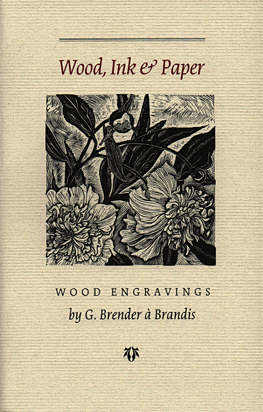
Wood Ink and Paper by Gerard Brender à Brandis
Brender à Brandis, with his engraver’s tools, has sketched a poem line the breadth of wind. It is about the possibilities of imagination, the strength of observation and, perhaps, the origins of life around us.
‘This volume, which brings together more than seventy [wood engravings] and an excellent introduction by the artist, carries with it the same brooding quality of that first print I saw of the Baldoon mystery house. The lines are rich and black, and the images -- abandoned schoolhouses, solitary silos, rough hewn barrels -- are like pastoral poems. In fact, this emphasis on nature and the small size of the woodcuts with the accompanying feeling on compactness and economy, suggests an affinity to the Japanese haiku. Brender à Brandis’ ability to capture mood is unparalleled.
‘In this book he draws us into scenes like that of a windswept kite set against a blustery spring day with the skeletal branches and fence rows, or that of a gigantic setting sun blazing through a field of winter wheat, or the quietude of an upstairs room in a farmhouse. There are also pictures of abandoned broken windmills, fishing tugs, pine washstands, black-eyed susans, windowsills ... all quiet, contemplative and reserved.’

1981—Society of Graphic Designers of Canada,
Commended
Review quote
‘Gerard ... sees himself in the longer tradition of medieval scribes and Gutenberg, and most of his important connections are with artists and craftsmen of Europe and the past. His engraving is very much in the British tradition, with the feel of such engravers as Mackley, Robert Gibbings, Joan Hassall and Monica Poole.... In Gerard’s case, being a book artist includes being able to do all aspects of the production himself. No other Canadian private press printer is able to combine typesetting and printing with wood engraving, papermaking, spinning, weaving and bookbinding. His lifestyle, which is spare and simple, imposes the onus of inventing and doing everything self sufficiently and provides the opportunity to explore his creativity as fully as possible.’
—Kim Lewis, Multiples, the Journal of the Society of Wood Engravers
Review quote
‘This book is a step on the way towards a better understanding of wood engraving in Canada, by making the work and philosophy of one of Canada’s best artists in this medium available at a modest price.’
—Hamilton Spectator
Review quote
‘I’ve been looking at the work in Wood, Ink and Paper for some time now, attempting to understand images cut so finely into wood and transferred to these pages. The time and precision necessary if each stroke is to take its place among the others must quiet the emotions. The artist’s feelings are as complex as the images themselves and, like those images, they are often ambivalent or understated. ...
‘Wood, Ink and Paper is well made and comfortable to the hand. The artist’s introduction offers insights into the engraving process as well as his feelings about his subject matter and the importance of the book as a format for his work. Brender á Brandis, with his engraver’s tools, has sketched a poem line the breadth of wind. It is about the possibilities of imagination, the strength of observation and, perhaps, the origins of life around us.’
—Brick
Review quote
‘Now for something entirely different ... Wood, Ink and Paper, a book of wood engravings by G. Brender á Brandis. This is actually a charming and rather lovely little book. On first impression, it may seem incomplete -- a series of illustrations without a story. But it’s more than that. ‘‘The book,’’ writes Brandis, ‘‘is not merely a container holding a number of small works of art -- it is a work of art.’’ I tend to agree. Nothing overwhelming -- a miniature -- but with every detail in just the right place.’
—Books in Canada
Author comments
The craft of printing designs from wooden blocks may have been brought by the Mongol invaders from China to the Near East and then by the Moslems or Crusaders to Western Europe, or it may have been invented quite independently by a European carver who saw the application of his craft to supplying the demand for printed fabrics and playing cards created by the increase of culture and trade in the later Middle Ages. In any case, it was being used in the early fifteenth century for printing books, a block being used for each page. It was Johannes Gutenberg’s contribution to realize that, if each block had only one letter on it, the blocks used to make up a page could be re-assembled to compose another. But the use of the wood block did not disappear from printing when Gutenberg replaced wood with cast metal. It remained the material for large initials, borders and illustrations. In the Oriental and earlier European process, the design was cut on the side or plank grain of blocks of cherry or pear wood with knives and gouges. In the latter part of the eighteenth century an English printer’s apprentice, Thomas Bewick (1753-1828) began engraving on the end-grain of boxwood blocks with burins. These tiny solid chisels differ from the sort used to engrave on metal only by the angle to which they are sharpened. Bewick’s own work covered an enormous range, from tickets and labels to large, detailed prints of birds and animals. He is best known for his suites of prints of birds and animals which he published in large volumes and sold very readily. From Bewick’s time to the latter part of the nineteenth century wood engraving was used primarily for commercial purposes such as the reproduction of paintings in the catalogues of public and private collections, the illustration of books, newspapers, and advertisements. There were a few notable exceptions, including the elaborate colour prints of George Baxter (1804-1867) whose artistry and skill have not been widely recognized. Wood engraving was then generally replaced by the appearance of photo gravure, only to re-emerge as an artist’s medium in the rebirth of fine printing by private presses, most notably the Kelmscott press owned and operated by William Morris (1834-1896). Although Morris drew and engraved some blocks himself (there seems to be very little in the field of arts and crafts he did not do himself), he relied on his friend, Sir Edward Burne-Jones, for much of the design, and on the Dalziel brothers for most of the engraving of the borders, decorative initials and illustrations for his editions. Private presses with more modest budgets, such as Lucien and Esther Pissarro’s Eragny press or the Vale press operated by Charles Ricketts and Charles Shannon, usually completed all the work including the design and cutting of blocks themselves. In Canada wood engraving has few champions: many have tried it but only a handful of artists chose it as their principal medium. Walter J. Phillips (1884- ) and H. Eric Bergman (1893-1958) are among the best known. Bruno Bobak (1924-), Thoreau MacDonald (1901- ), Leonard Hutchinson (1896- ), Laurence Hyde (1914- ) and Julius Griffith (1912-1998) have all worked on end-grain wood. Rosemary Kilbourn (1929- ), though perhaps better known for her work in paint and stained glass, has produced what I feel to be the most exciting contemporary work in this medium in the country.
At a recent exhibition of the Society of Wood Engravers and Relief Printers in London, England (August 1977), I saw not one print that could be called non-objective. Whether this reflects an overly conservative and tradition-bound attitude on the part of the wood engravers to their work, or whether it may be attributed to an honest recognition that this medium is indeed best suited to representational modes of expression, I am not prepared to decide. My own single foray into non-objective design was most unsatisfying and I have no intention of pursuing that direction. On the other hand, the close relation of black-and-white visual imagery with literary imagery seems to me a limitless field. The selection of poems or prose and the appropriate engravings is not always easy. Since the engravings are precise, definite and linear there must be something of the same in the words. The misty convolutions of psychological exploration seem to be more or less incompatible with engraving.
This comfortable connection between wood engraving and the printed word is only one of the reasons that I prefer to present my prints in books rather than in frames. I am happiest when working at a small scale, both because my ideas for prints are usually such that they will fill only a small space and because, in a small design, each stroke of the burin counts for a great deal more than simply contributing to a large area of texture. Small prints should be looked at from a short distance and with good light: one is more inclined to take a book to a window and hold it at a good angle than is one with a framed print. Any pictures on the wall are inclined to become over-familiar, while a book, opened on the occasions when the urge is felt, remains less of a worn experience. Books allow one to see the prints without the barrier of glass and its inevitable reflections or distortions and to look in a book is usually a private and intimate experience -- one holds and touches the print rather than standing back at a polite distance as in a public gallery. Altogether I find that looking at prints in a book is the most satisfactory way to enjoy them. I would not want to suggest, however, that a book is merely a preferred alternative to a frame as a presentation for prints. When I plan a book I plan a sequence of communication, an experience with an element of passing time, a production with a beginning, middle and end, with a certain rhythm and climax, much like a small theatrical production. I also see the book as an important object in itself, a tactile and three-dimensional being. The book is not merely a container holding a number of small works of art -- it is a work of art. And further, a book is, to me, a social creative event, a collaboration between several people, blending their ideals and skills.
When I began my art studies I had never heard of wood engraving. I had done a few lino-cuts and woodcuts, but the inherent coarseness of those media left me dissatisfied because of my pleasure in small detail. I looked forward to etching, in which I knew fine detail was possible, but was disappointed when I found it necessary to work with dangerous and foul-smelling acids, and distressed by the ‘feel’ of working with metal. Then, too, there was the further obstacle of the need for a costly etching press to proof the plates. Imagine my delight on being introduced to a medium which allowed me to include every tiny line and dot the eye could see and yet work in the most responsive and congenial material I knew ’ wood. For several years I proofed my blocks and printed my editions by burnishing (rubbing the back of the paper with a wooden spatula) until 1971, when I acquired an Albion hand-press.
My working methods have not changed much since I began, though the finished products have shown variations in style. I make preliminary sketches, usually in pencil, in front of the subject, only rarely trusting my memory for accuracy and form and detail. I have great difficulty in using photographs as a means of collecting information about subjects because they do not allow the editing and selecting possible in a sketch. Photographs, I find, are most useful to recapture the feel or atmosphere of a time and place. Only occasionally do I draw directly from the subject onto the block without an intervening sketch. In the case of buildings or specific landscapes or asymetrical objects, I must reverse the drawing so that it appears in ‘mirror image’ on the block. Botanical and wildlife subjects are not normally reversed. My drawings on paper or on the block are very sketchy, defining outline and tone but avoiding specific texture. If I were to produce a very precise drawing on the block, I fear that the engraving process would become mechanical, and thus, boring. I want the cutting of the design to remain as free, challenging and creative as possible. So many people observe, when looking at a completed block, that it must require a good deal of patience to produce one. My invariable reply is ‘No’. Good eyesight and a steady hand, yes, but not patience. I enjoy chipping away at a design immensely, though it can be very tense and tiring work, as a slip of the tool will usually destroy the design and each stroke of the burin must be accurately determined. Lines cut into wood cannot be erased as those that are drawn onto paper with pencil. I try to engrave not more than three or four hours per day, using the remaining hours for the many other activities of a working studio.
Every stroke of the burin produces a white mark in the finished print since, in wood engraving as in other ‘relief’ printmaking processes, the ink is rolled onto the surface of the block. This means that the black lines of the drawing are left standing and everything else cut away -- a kind of ‘negative’ drawing. This process pleases me particularly, since I am introducing light into an otherwise dark space. To render light dark is to do the devil’s work: to bring or add light has more positive connotations. The length of time it requires to engrave a block depends more on the amount of white in the design and the fineness of texture and detail than on the actual size of the block. There are no grey tones in wood engraving, as all the printing surface is covered with black ink. The subtlety of cutting fine textures may suggest grey tones to the eye and mind, and small areas may be slightly lowered with a chisel prior to engraving so that they will print with slightly less pressure and appear grey.
The printing of these blocks is a less routine matter than might be expected. Some blocks print best when inked lightly and printed firmly; others are better inked heavily and given what printers call a ‘kiss’ impression. Some are well suited to being printed on the somewhat rough-surfaced European papers whereas others call for a polished tissue of Oriental mulberry fibre. Almost all printing is facilitated by a more than usually humid atmosphere and fairly warm temperature. Predictably, there is no agreement among printmakers or collectors as to which impressions are ‘best’; one will prefer a very black print while another will choose an impression that allows the texture of the paper to show through the ink -- a ‘lean’ impression, I call it, and usually the sort I look for when selecting a print for my own collection. Invariably some impressions will have to be discarded, either because of faulty technique such as over- or under-inking or because some flaw in the paper not noticed earlier becomes apparent when the print is made. Fortunately, there is almost no limit to the number of impressions that can be pulled from a well-cut block of sound boxwood. In contrast to a copper plate worked in dry point, which may yield as few as twenty impression before wearing of the plate becomes offensive, end-grain blocks have been known to produce over a hundred thousand clear impressions. The limiting of editions from these blocks is therefore a more or less artificial exercise, done perhaps to increase the selling price of the prints (usually demanded by dealers and collectors who see art primarily as investment) or because the artist is not eager to subject himself to the tedium of printing thousands of nearly identical impressions but wishes instead to move on to new work. It is usual to have blocks that are not to be printed again planed down and polished so as to extend use of the rare and precious boxwood. -- G. Brender àBrandis
Feature
Visit the artist in his studio/gallery at 249 Ontario Street, Stratford, Ontario. The studio is open to the public during the Stratford Festival season (approximately 15 May to 31 October) -- Wednesday through Sunday 10am to 6pm (closed Monday and Tuesday) and at other times by appointment (519) 273-7523.
The front room of this 1877 Ontario cottage is an informal exhibition space, with a table and chairs -- even a rocking chair -- that is equally inviting on a warm summer afternoon or a rainy day in October. Here you will find many wood engravings of garden plants and wildflowers (some hand-tinted), birds and other small creatures, scenes and old buildings both local and remote, in a choice of framed or shrink-wrapped or unmounted formats. There are usually some studies in pencil, ink, watercolours or oils, a cabinet holds books and chapbooks in handmade, limited editions. Commercial books illustrated by the artist are also available, as are some hasti-notes.
The central room is the studio where it all takes place -- designing, engraving, typesetting, printing, bookbinding and weaving. The focal point of the studio is an Albion, hand-operated printing press made in 1882. There is always work in progress and a visit provides both an opportunity to learn about traditional bookmaking techniques and an insight into an artist’s creative process.

A member of the Wood Engravers’ Network, Gerard Brender à Brandis has produced hundreds of drawings, wood engravings and watercolours of plants, landscape, buildings and musical instruments. These images have appeared in books, including Wood, Ink and Paper, At Water’s Edge and Portraits of Flowers (all published by The Porcupine’s Quill) as well as in his own handmade editions. His work is represented in the collections of the Royal Botanical Gardens (Hamilton, Ontario), the Missouri Botanic Garden, the Arnold Arboretum and the Hunt Botanical Library. His garden and his studio are located in Stratford, Ontario.
For more information please visit the Author’s website »
The Porcupine's Quill would like to acknowledge the support of the Ontario Arts Council and the Canada Council for the Arts for our publishing program. The financial support of the Government of Canada through the Canada Book Fund (CBF) is also gratefully acknowledged.