|
|
|
Current Exhibition Exhibition 5 Ms Cassie in the Wings (27K) Ms Cassie & Apollo (23K) Ms Cassie Reads the Young Matelot's Horny Palm (17K) Ms Cassie After (51K) Ms Cassie & Glance Backwards (26K) Ms. Cassie in Tears (19K) Previous Exhibitions Exhibition 4 Ms Cassie's Complaint (20K) Eclipse (30K) Ms Cassie's Assignation (16K) Ms Cassie in Bed (19K) Ms Cassie Arsy Versy (23K) Ms Cassie and Witness (19K) Exhibition 3 Ms Cassie On the High Veld (15K) Ms Cassie and Salamander (29K) Ms Cassie and Siren's Song (28K) Ms Cassie and Dove Legend (9K) Ms Cassie and Courier Service (31K) Ms Cassie and the Night Sky (36K) Exhibition 2 Ms Cassie Has Congress With Death (22K) Ms Cassie Embittered (21K) Beholder (22K) Hinterland (33K) Ms Cassie Reflects On Visions Before Midnight (40K) Ms Cassie's Autumn at the White Cottage (25K) Exhibition 1 Cover Her Face With a Black Bandana, Ma (40K) Ms Cassie Confronts the Sun (18K) Fit to be Tied (40K) Ms Cassie Abandoned (30K) Ms Cassie Writes an Open Letter (19K) Ms Cassie By Night (91K)
|
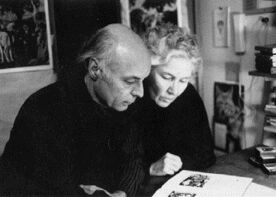
About the broadsheetsWhen, early in 1960, Barbara Howard and I decided to start up a small
press (`found' would then have been a term unfamiliar to us in this
connection; and with no pecuniary motive we did not think of
ourselves as `proprietors'), we had several motives and numerous
confusions.
Barbara had become interested in and was producing her first wood
engravings. She sought a practicable alternative to hand-burnishing; a press of
some sort seemed an obvious answer.
Largely through my close friendship with Allan Fleming, I had become
aware of some of the complexities, niceties and rewards of fine
printing, typography and book production. Allan encouraged me in the
notion that nothing so enables one to appreciate these matters as
does the actual designing, setting and printing from type and blocks.
My own output of poems was rapidly outstripping the realistic
possibilities of ephemeral publication; one of the obvious solutions
was to produce small editions of at least a few poems ourselves, for
our own pleasure and that of a few friends.
Also we had produced, by one means or another, a Christmas keepsake
each season since our first coming together, in London in 1955. That
first effort was in fact a linocut, printed on mulberry paper and
tipped onto a grey sugar-paper card. Latterly, however, we had
keepsakes commercially designed and printed; a press of our own would
enable us independently to produce our future keepsakes, a practice
that had become increasingly meaningful to us both.
Our confusions were those of any largely uninformed amateurs
approaching a craft with longstanding, elaborate disciplines.
Youthful enthusiasm and some sound counsel, however, were sufficient
to get us moving in the right directions, and we had the good sense
to learn from our initial mistakes. And we were sensible of the
pronouncement of that master typographer, Jan Tschichold:
`Beginners and amateurs in typography attribute too much weight to
so-called inspiration. Perfect typography comes into being through
the correct choice between various possibilities, the knowledge of
which rests on long experience. The right choice is a matter of tact
and taste. In a good typographical design all single units are
interrelated by a single idea. Good typography is an extremely
logical art, and it is precisely this inexorable logic that
distinguishes it from other art forms.'
Reprinted from A Brief History of Time at The Gauntlet Press
(Or, Some Days the Earth Moved) by Richard Outram, the full
text of which is available Here.
|
First broadsheet: Ms Cassie in the Wings | About the Author | Up to Top | PQL Home