The Porcupine’s Quill
Celebrating forty years on the Main Street
of Erin Village, Wellington County
PRESS CLIPPINGS
Here you will find press clippings from the early nineties to today. Earlier reviews are from the time that John Metcalf added his editorial skill to the production standards that had been developed through the eighties. More recent reviews are from independent magazines, focusing on independent presses.
Indie Groundbreaking Publisher
© 2012, Independent Publisher
This month’s Indie Groundbreaking Publisher, The Porcupine’s Quill (PQL), is a small book publishing company in Wellington County, Ontario, Canada that proves that the best way to print isn’t always the easiest way. At PQL’s headquarters on Main Street in Erin Village, you’ll likely spot co-founders Tim and Elke Inkster printing and binding the majority of the company’s titles themselves.
‘The Porcupine’s Quill began in 1974, originally as the production arm of Dave Godfrey’s Press Porcépic,’ comments Tim Inkster. Inkster had been working for Dave Godfrey when the company moved from Toronto to the more rural Wellington County where PQL is now located. The Porcupine’s Quill began after Inkster discovered that his taste for publishing was different from Godfrey’s.
‘Not too many months had passed before I realized that I was more interested in the production side of publishing,’ Inkster explained. ‘I knew Dave Godfrey would not likely be inclined to invest in antiquated printing equipment. Godfrey’s interest in publishing was editorial, primarily, and political. Mine was more practical. I enjoyed making books.’
Elke and Tim Inkster purchased their first 1905 model Smyth National Book Sewing machine and began printing and binding books, publishing PQL’s first title, Marzipan Lies, a collection of poems by Brian Johnson, in 1975. According Inkster, ‘The Porcupine’s Quill did a lot of contract book printing for a variety of small publishers in the 1970s and 80s’, while continuing to publish a few of their own titles during that time. The Inksters faced a few financial battles and mechanical mishaps along the way, acquiring several machines before purchasing the Heidelberg KORD on which today’s books are printed in-house.
Hand-sewing books is a lengthier process than printing using more automated methods, but Elke Inkster has been using the Smyth National for years. To put things in perspective, Inkster elaborates, ‘Elkie is very quick, and can often sew 7500 signatures a day. That could easily be 500 copies of a 160 page (ten signature) book.’
When asked why PQL prints the majority of its own books, Inkster promotes the value of a handmade book.
‘I am reminded of an instance (some years ago) in which a young designer, working for a much larger publisher company, challenged RR Donnelly (a large Chicago book printer) to match a PQL product. And Donnelly could not. Partly because of the paper, partly because of the sewing, in 16 page signatures, partly because of the endpapers in a trade paperback format.
‘I am, of course, limited in what I can do. I recognize that. On the other hand, I also recognize that what I CAN do, I can do very well. And there are any number of larger competitors who CANNOT do what I can do. This provides a constant source of amusement in the twilight of my career.’
PQL not only prints, sews, and distributes collections of poems and novels, but also features an entire series of printed wood engravings, which they call their The Wordless Novel Series. Tim Inkster describes his experience publishing his first wordless book:
‘We first encountered contemporary wood engraving at a Wayzgoose event in Grimsby, Ontario, in the late 1970s. It took us a number of years to convince Gerard Brender à Brandis that we could do justice to his engravings, reproducing them on an offset press, but in the end we prevailed and Wood, Ink & Paper appeared in June, 1980.’
Engravers Wesley Bates and George A Walker were moved by what they saw of the Inkster and Brender à Brandis collaboration, and subsequently have both been published by PQL. The wordless novel series features engravers like these who, according to the series’ website, ‘create visual narratives [in wood] which are then scanned and published in a format that uses 20th century offset printing technology.’
Tim and Elke Inkster know a good manuscript and can recognize a quality engraved storyline when they see one. Their published titles have won countless awards, including several IPPYs, and the pair were appointed to the Order of Canada in 2008 ‘for their distinctive contributions to publishing in Canada and for their promotion of new authors.’
I asked Inkster of which award he was most proud, and he answered, ‘I am most proud of the Leipzig medal that was hand delivered by the East German ambassador to Washington, although at a time that Canada did not recognize East Germany. The ceremony took place at the Westbury Hotel in Toronto.’ He added, ‘My father was also happy because the ambassador subsequently sent Walt a fulsome box of elaborate Eastern Bloc stamps to add to the family stamp album.’
The Porcupine’s Quill is a publishing company devoted to producing authentic, handmade books, whether the pages are full of text or images. The expertise with which they use the Heidelberg KORD and Smyth National machines is evident in the award-winning quality of their books. Their website describes their ability to ‘use twentieth-century offset printing technology to replicate the quality look, and feel, of a nineteenth-century letterpress product.’ While most of us are going entirely digital, PQL is sticking to its guns with finesse, and that is groundbreaking.
—Ariel Bronson, June 2012
back to topEverything Old is New Again
© 2012, ForeWord
Tim Inkster, publisher of The Porcupine’s Quill in Erin, Ontario, recently took time to reflect on the literary press’ origins and future prospects.
ForeWord: Why does The Porcupine’s Quill exist, and who’s your audience?
Tim Inkster: I was studying English at the University of Toronto when I took a course from the legendary Dave Godfrey, who had founded the House of Anansi in Toronto in 1967 along with poets Dennis Lee and Allan Ginsberg. After graduation in 1971, I started work as the sole employee of Dave Godfrey’s Press Porcepic. The Porcupine’s Quill was established in 1974, originally as the production arm of Porcepic.
In the 1970s and 80s our primary market was the Canadian independent, but many of those stores, like Longhouse, Double Hook and Britnells, no longer exist. We tried, unsuccessfully, to adapt to the merger of Chapters and Indigo in Canada in the late 1990s, but lately our growth markets are the e-tailers and the big US wholesalers, and a significant part of our export marketing strategy leverages the opportunities offered by ForeWord magazine.
FW: What criteria do you use when selecting books to publish?
TI: Is serendipity an acquisitions strategy?
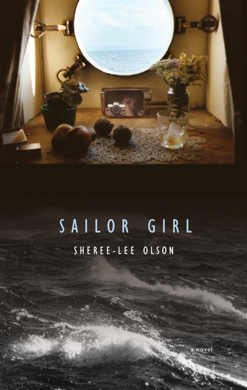
In March of 2005, for example, I received a query from an unpublished author who said she had a manuscript for a novel about commercial shipping on the Great Lakes. I was more than casually interested. My father had sailed, briefly, as a deckhand on the Lakers in the late 1930s, and my father’s father was Captain Walter Inkster of Collingwood, who was something of a legend on the Lakes. At the time, however, PQL was facing returns problems and cash-flow problems and I had decided that drastic measures were to be implemented. I responded to the query from Sheree-Lee Olson, whose name I did not recognize, and told her a little of my personal interest in her book, but also that we were not in a position to consider new commitments.
A few days later I received a telephone call from Rebecca Caldwell at The Globe & Mail who reminded me that her boss, Sheree-Lee Olson, was editor of the Style section of Canada’s National newspaper. Rebecca wondered if I would be willing to repeat anything I had said privately to Sheree-Lee, for publication.
‘Literary gem to cut staff, book list’ by Rebecca Caldwell appeared in The Globe on March 31, 2005. That was a low point. Two years later I found myself, much to my surprise, ’still in business’, so I contacted Rebecca Caldwell to see if Sheree-Lee had found a home for Sailor Girl, which she had not.
Sailor Girl appeared in June of 2008 at a raucous launch at Ben McNally Books on Bay Street in Toronto. The cover is amusing because it features a self-portrait of the author as a young woman in her cabin on a Laker, and I was particularly pleased with the full-colour maps of the Great Lakes on the inside of the covers, the engravings of portholes we used as section breaks, and the propellors we used as tailpieces. The Globe & Mail complimented the author on her ’deft poetic style’ that ’imprints characters and situations with casual grace and potency.’
My wife Elke and I were thrilled, in October, to be able to attend a ceremony unveiling a Project Bookmark Canada plaque for Sailor Girl at Lock 8 on the Welland Canal in Port Colborne.
FW: Tell us about the role of design in your offerings.
TI: The Porcupine’s Quill has built, since 1974, an enviable reputation for expertise in the use of twentieth-century offset printing technology to replicate the quality look, and feel, of a nineteenth-century letterpress product. Most of the production work is completed at the shop on the Main Street of Erin Village, where books are printed on a twenty-five inch Heidelberg KORD, folded, and then sewn into signatures on a 1905 Model Smyth National Book sewing machine. We print on acid-free Zephyr Antique Laid that is milled to our specifications by Cascades Fine Papers at their mill in St Jerome, Quebec.
Many of our publications involve collaboration with contemporary wood engravers such as Gerard Brender à Brandis, Wesley Bates, George A. Walker, and Jim Westergard.
FW: Speak about any challenging moments in the history of the press.
TI: In the mid-eighties I was asked to address a round table at the Royal Ontario Museum which gave me a means to apprise the Deputy Minister of Culture of difficulties I was experiencing with one of the Big Five Canadian banks. One of the Ministry’s bureaucrats interceded, on my behalf, with the head office of said bank, which thereupon encouraged their regional office to take action.
By the time this well-intentioned directive from Bay Street reached Erin Village, some weeks later, the local branch manager mistakenly thought he had been instructed to put me out of my misery. I was given ten days to repay a quarter of a million dollar demand loan. Which I did, with the help of another bank. But I didn’t sleep well, for many of the ten nights.
FW: Can you tell us what constitutes good design, from your perspective?
TI: Good design happens at the intersection of function and form.
Complete Physical, for example, is a collection of poems about the practice of family medicine in a small town in rural Ontario. The book is illustrated with 19th-century engravings taken from physiology texts we found abandoned in a barn in Wellington County in the early 1970s. But the specific placement of the images was informed by the poet’s two major section heads. In Part One, ’White Coat’, we used images suggestive of diagnostics, hence, ears, eyes, nose and throat. Part Two, ’Black Bag’, features organs such as kidneys, spleen and the diseased liver of an alcoholic. The subtle visual humor starts with the cover, on which a skull is seen to be smelling the feet of a skeleton, mincing the popular misconception that disease emits an odor. The humor extends to the endpapers, which are hospital green, the bit of red blood on the cover, and the gratuitous inclusion of a bookmark / tongue depressor on which an open mouth leads down the digestive tract to the bowels.
FW: Share some artists and books that you love.
TI: We recently published a new edition of James Reaney’s classic pastoral eclogue, A Suit of Nettles, with wood engravings of geese dressed in Victorian costume that we commissioned from Jim Westergard of Red Deer, Alberta. The original edition was published by Macmillan in 1958, and designed by the great Allan Fleming. The poem is a pastiche of Spenser’s Shepherd’s Calendar but the characters in the narrative are geese that Reaney remembered from his mother’s barnyard in Easthope, outside of Stratford, Ontario. I think our edition is superior to the Macmillan original. I’m proud of that, to be a player in that league.
FW: What’s in the future for The Porcupine’s Quill?
TI: I am told that Minister James Moore of the Department of Canadian Heritage believes the future of literary publishing is digital. We have perhaps three dozen recent frontlist titles available for sale as e-Books on Google, but sales, thus far, since 1 November, are miniscule.
We are working closely, on the other hand, with wood engraver George A. Walker, who embraces nineteenth-century printmaking techniques to produce wordless novels such as the Book of Hours or the upcoming Mysterious Death of Tom Thomson, which we then digitize and release as popularly-priced offset productions that look better on the iPad than they do in ePub format.
—Tim Inkster, March 2012
back to topCanada’s Loveliest Books are Made in Erin?
© 1992, The Montreal Gazette
Imagine a small publisher that not only cares about good writing, but also goes to immense lengths to make that writing accessible in permanent, beautiful form. Imagine a small publisher that, instead of gluing its pages into the spines of books (thereby making it likely that the book will one day disintegrate), sews the pages together so that they’ll never fall apart. Imagine a small publisher dedicated both to discovering new, young writers and to reprinting the best Canadian literature from the past.
You’re imagining The Porcupine’s Quill.
Since 1974, Tim and Elke Inkster have been operating this unique enterprise out of their combined home and printing shop in the little town of Erin, Ontario, about 100 kilometres northwest of Toronto. They and a handful of employees support themselves by printing books and magazines for other Canadian publishers - if you examine the copyright page of any unusually good-looking small-press book, chances are that it will have been printed and bound on ‘acid-free Zephyr Antique laid’ paper at The Porcupine’s Quill.
‘The way I look at it,’ Tim Inkster told me the other day, ‘the printing excellence we’re known for is a very sophisticated and understated marketing tool. The authors we publish are important, and we want to make sure their works last.’
But there’s more to it than that. Just think of the magnificent cover that graces George Johnston’s collected poems, Endeared by Dark. Since Johnston is a noted translator from Old Norse, Inkster decided that a Viking motif would be appropriate for the book. His unofficial editor-in-chief, John Metcalf, found a photograph of the celebrated Oseberg Ship in Norway; but the photo was not good enough to reproduce directly. So Inkster passed it to an artist, Virgil Burnett; and from Burnett’s pen-and-ink drawing, Inkster had a magnesium die made. Onto each cover, the die was then foil-stamped by hand.
A complicated process - but the result is a joy to behold. ‘It’s about as nice a production as I’ve ever had,’ Johnston says dryly. Against a pale, gray-blue background, the ship’s embossed prow soars in gold. ‘Visually, it’s something of a ghost ship,’ Inkster explains. ‘The way you perceive the image changes according to your point of view. It’s designed to sail through your imagination.’
And one way or another, that’s what a lot of Porcupine’s Quill books have been doing of late. Two of them, by Terry Griggs and Don Dickinson, were nominated for the 1991 Governor-General’s Award for fiction. A volume of photographs by Montreal’s Sam Tata sold out soon after publication; Inkster plans to reprint the book this year.
And to celebrate Irving Layton’s 80th birthday last month, it was The Porcupine’s Quill, rather than a large and famous press, that published his selected love poems, Dance With Desire. I’m told that about 200 people had to be turned away from the book’s standing-room-only launch in an Ottawa café.
The Porcupine’s Quill now has 92 titles in print. A surprising number of its books have a Montreal connection, starting with the very first: Marzipan Lies, a volume of poems by Brian Johnson. (Back in 1974 he was labour reporter at The Gazette; nowadays he’s a respected magazine journalist in Toronto.) The press’s new series of reprints goes under the name ‘Sherbrooke Street,’ not only because of John Metcalf’s old association with Montreal, but also because, as Inkster wryly remarks. ‘I suffered for four years at the hands of the Jesuits in Loyola High School.’ So far, Sherbrooke Street reprints have included books by Layton, Louis Dudek, Clark Blaise and Ray Smith, all of them closely linked to this city.
For the last three years, Inkster has had little hand in choosing the books he so brilliantly publishes. That task has been placed largely in the hands of novelist John Metcalf: famous for his curmudgeonly attitude to Canadian literature, less famous for his shrewd and generous championing of young (and not so young) authors. The irony is that Metcalf, who has loudly complained about the destructive impact of Canada Council subsidies, works for a press that couldn’t exist without Canada Council money. He works, please note, for free.
Metcalf has high ambitions for The Porcupine’s Quill. ‘I have a very strong vision of what I want the press to be,’ he told me: ‘the Canadian equivalent of Faber & Faber in London. I just want the best damn literary press in the country. I’d like young writers, if they were faced with a choice between Macmillan and ourselves, to say: ‘I’ll go to The Porcupine’s Quill, that’s where the action is."’
Over the next year, action at the press will include the appearance of John Newlove’s selected poems, of a new short-story collection by Hugh Hood (with the marvellous title You’ll Catch Your Death) and of Ray Smith’s novel A Night at the Opera. ‘It’s one of the most eccentric goddamn books I’ve ever read,’ Metcalf says cheerfully. ‘I’m very proud of it.’
—Mark Abley, April 1992
back to topThe Porcupine’s Quill
© 1991, Books in Canada
Tim Inkster started in the basement - that is, shovelling cat dirt out of the basement at 671 Spadina Avenue in Toronto, the famous address where the House of Anansi, New Press, and Press Porcépic all began. Inkster graduated from the University of Toronto in 1970 and went to work at Porcépic for one of his professors, Dave Godfrey. But he and his wife, Elke, decided that Toronto was a lousy place to live on low wages, and persuaded Godfrey to move Porcépic out of town. Godfrey chose Erin, Ontario.
The Porcupine’s Quill, the press that Tim and Elke Inkster eventually founded, might be called ‘second wave,’ arising directly out of that first wave of nationalist Canadian publishing that began in 1967. Working as the pressman for Porcépic, Tim Inkster (what a wonderfully fated name) because frustrated by Godfrey’s unwillingness to invest in a decent printing press. So in 1974 he and Elke started Porcupine’s Quill simply as a production arm. But when the arrangement didn’t work out, the Inksters decided to become independent, bought their own building across the street - where they still operate - and moved in above it.
If the backlist of the press seems a rather eclectic mix of poetry, fiction, visual art, criticism, and young adult novels, the reason is that the press developed its editorial taste somewhat after the fact. Tim Inkster says, ‘Our first book was in 1975. By that time we’d been doing quite a bit of book printing for a variety of small publishers. And I was frustrated as a printing craftsman that I couldn’t convince any of the publishers to put the kind of money that I thought appropriate into some of these titles for their best presentation.’ To show them how fine a book could look, Inkster obtained a poetry manuscript from an old college friend, Brian Johnson (now the film reviewer for Maclean’s), and a new publishing line was born.
Over the years the press’s books have won design awards from the Alcuin Society and the Art Directors’ Club of New York. While the editorial direction has been less consistent than the production values, Porcupine’s Quill has still published an impressive group of writers: Hugh Hood, Richard Outram, James Reaney, and Robin Skelton among them. Recently two titles, Jane Urquhart’s Storm Glass and Mark Frutkin’s Atmospheres Apollinaire, were picked up by David R. Godine in the United States. Over the years writers such as Urquhart and Joe Rosenblatt have helped out as voluntary editors. But now an overworked Inkster (whose printing operation subsidizes the press) has given over much of the editorial decision-making to a triumvirate of experienced and, to say the least, opinionated editors: John Metcalf, John Newlove, and J.R. (Tim) Struthers. The three have already brought a new, invigorated direction to the press.
‘I think it is an unusual situation, but one that I’m very pleased about,’ says Metcalf, the fiction writer and polemicist who for years has been trying to shake up Canada’s literary establishment. Metcalf and Inkster first discussed The Porcupine’s Quill over dinner two years ago at the University of Guelph. Out of that conversation has come Sherbrooke Street, a reprint series whose first titles are Ray Smith’s Cape Breton Is the Thought Control Centre of Canada, Irving Layton’s The Improved Binoculars, and Clark Blaise’s Lunar Attractions. While Inkster has his eye on the university market, Metcalf is hoping these reprints will capture that elusive beast, the general reader. ‘I thought that the series was necessary in Canada because we lose our culture every 15 to 20 years,’ he says. ‘Suddenly it’s as though collective memory has been wiped out and we have to start all over again.’ Forthcoming in the series are selected editions of Hugh Hood and Leon Rooke, as well as Norman Levine’s Canada Made Me and From a Seaside Town.
Metcalf plans to emphasize both the short story and new writers, and he has done both with well-received first collections by Terry Griggs and Dayv James-French. Another first book, by Don Dickinson, is imminent, and Metcalf is currently working on a book of stories by the poet Steven Heighton. Metcalf says, ‘What I’m looking for is stuff that just comes off the page at me. Where the language is vital and interesting. When you read the first paragraph it’s as though you’re receiving an electric shock. And that kind of feeling tends to go with formal innovation.’
Metcalf and his editorial colleagues also hope to rewrite our literary past with a series of histories and bibliographies. Currently being written for the press are an annotated checklist of the House of Anansi by Douglas Fetherling, a history of the Contact Press by Bruce Whiteman, and a book on collecting Canadian literature by the Toronto bookseller Steven Temple. This is indeed a new era for The Porcupine’s Quill, and it looks to be a very interesting one for the general readers out there, as well.
—Cary Fagan, July 1991
back to topSmall Press, Big Ideas
© 1990, The Globe and Mail
Among the first things you see when you enter the office of the literary press called The Porcupine’s Quill are the awards for book design proudly affixed to the walls. There are Litho Awards and award certificates from the Alcuin Society, the Art Directors Club, the Malahat Review, the American Institute of Graphic Arts, the Society of Graphic Designers of Canada and the Leipzig Book Fair. One of these certificates, for Virgil Burnett’s A Comedy of Eros, bears an inscription: ‘Book design is one of the excellencies by which a civilization can be measured.’
It’s an inscription that could serve as a motto for Porcupine’s Quill owner-operators, Tim and Elke Inkster. They manage to live an eminently civilized life in their restored storefront building on the Main Street of this Southern Ontario town, all the while producing uncompromisingly fine books of literary fiction and poetry.
‘I do what I do because I want to do it,’ said the slim, bearded and boyish-looking Inkster recently. He puffed on a pipe in his back yard (‘my award-winning garden,’ he calls it) while looking out over the Credit river - a location he thinks is marvellously appropriate for a publisher. ‘I could make a lot of money doing job printing, but it would be a very frustrating way to live.’
Inkster (a marvellously appropriate name for a printer-publisher) was born in Toronto 40 years ago and raised in Montreal. He attended the University of Toronto as an English major, and while there heard a lecture on typography by Coach House founder and pressman Stan Bevington. That marked the beginning of Inkster’s obsession with making fine books. He went to work for Press Porcépic, under publisher David Godfrey, in 1969, and in 1970 he and Elke moved with the operation to Erin, from its original headquarters on Spadina Avenue in Toronto.
The Porcupine’s Quill began life as the production arm of Press Porcépic. Porcupine and Porcépic split in 1974, when Godfrey and Porcépic moved to Victoria, B.C. The Inksters eventually moved into a beautiful renovated apartment above the shop - the printshop occupies the basement, and the darkroom, bindery and offices are at street level.
The first Porcupine’s Quill list, in 1974, included Marzipan Lies, by Brian Johnson (now the film critic for Maclean’s magazine) and Scenes, by E.J. Carson, now better known as Ed Carson, head of Random House of Canada. ‘It was a book of nature poems, about canoeing in Algonquin Park,’ Inkster said. ‘It did terribly Replica Franck Muller but it’s still in print , after 14 years. That’s one of the things a little literary press does.’
Since going out on their own, the Inksters have published 85 books, including works by such well-known writers as Clark Blaise, Marilyn Bowering, David Carpenter, Rikki Ducornet, Louis Dudek, Mark Frutkin, Hugh Hood, Irving Layton, Susan Musgrave, James Reaney, Robin Skelton, Ray Smith, Jane Urquhart and Adele Wiseman. The Porcupine’s Quill publishes eight or nine books a year these days, and has net sales of about $45,000.
Porcupine’s Quill books are significant in literary terms, but what sets them apart from most of the hundreds and thousands of other books published yearly in Canada is the loving care of their design and production. Hardly any trade fiction is printed in Canada with sewn bindings, for instance, but that’s the only way The Porcupine’s Quill works.
The bindings, sewn on a machine built in 1907, combined with the high-grade paper stocks Inkster also insists on, result in books that are built to last.
The catalogue An Honest Trade, prepared by Inkster for a 1983 exhibit of Quill-produced books presented at the Banff School of Fine Arts and several other locations, contains physical descriptions of the books that are downright lyrical. Consider this one, for Burnett’s odd little novel Skiamachia: ‘Sewn paperback printed on Warren’s Lustro Dull Cream, with Strathmore Grandee barcelona grey endpapers. Cover is black on Strathmore Grandee white/navarre blue duplex, plus white hot foil-stamping. Typeset in Baskerville by Howarth & Smith (Toronto), titling is Castellar initials, hand-pasted from PMT’s.’ It’s enough to make a romantic shiver.
‘Each one of these areas of quality costs money,’ Inkster said. ‘It’s hard to find people willing to pay for it.’ Writers love this sort of quality in their books, and so do a surprising number of other publishers. The Porcupine’s Quill has printed books for many other publishers over the years, including Black Moss, Exile, Penumbra, Prise de Parole, Aya, Mosaic, Boston Mills, Red Kite, Netherlandic and Brick.
‘Our publishing business is largely supported by the printing business, and to a lesser extent by grants,’ Inkster said. ‘What makes money is designing, printing and binding for other publishers.’ The Porcupine’s Quill has had books that do well commercially, in small press terms, including several young adult novels that keep going into reprints. James Reaney’s The Boy With An R In His Hand, for instance, has sold 5,000 copies since 1984 and is into its fifth printing. Inkster sees more young adult novels in the Quill’s future, perhaps through the Literary Press Group, a co-operative sales organization for the country’s small publishers.
‘It’s what we’ll have to do to survive,’ he said. ‘Free trade won’t give us access to the American market. What we need is more access to the Canadian market.’
A more typical Quill book in many ways is George Johnston’s Collected Poems, a beautiful book just published by The Porcupine’s Quill. Inkster printed 500 copies of the book; total advance trade sales in Canada were 45 copies. ‘That book cost me $12,000 to produce, and it’s beautiful,’ he said. ‘But it’s pretty clear we’re not going to stay in business if we depend on publishing books like that.’ Inkster doesn’t even bother with costing sheets, which most publishers use to calculate book prices by factoring in the size of the print run, the type and size of paper, the number of pages, the method of binding, etc.
‘There would be no point,’ he said. ‘If I did a proper costing, it would give me a ridiculous set of numbers. I’d have to charge $25 for a paperback edition of George Johnston’s poems.’
So is Inkster happy? He smiles and nods, but the question leads him to thoughts of tight money, tight margins and the GST.
‘You’d think after 20 years of doing the same thing, it would get easier,’ he said. ‘But it doesn’t. It gets harder and harder.’
—H. J. Kirchhoff, July 1990
back to topThe Porcupine’s Quill would like to acknowledge the support of the Ontario Arts Council and the Canada Council for the Arts for our publishing program. The financial support of the Government of Canada through the Canada Book Fund (CBF) is also gratefully acknowledged.
Browse Press Clippings:
- Indie Groundbreaking Publisher by Ariel Bronson, reprinted from Independent Publisher, 2012
- Everything Old is New Again by Tim Inkster, reprinted from ForeWord, 2012
- Canada’s Loveliest Books are Made in Erin? by Mark Abley, reprinted from The Montreal Gazette, 1992
- The Porcupine’s Quill by Cary Fagan, reprinted from Books in Canada, 1991
- Small Press, Big Ideas by
H. J. Kirchhoff, reprinted from The Globe and Mail,
1990