The Porcupine's Quill
Celebrating forty years on the Main Street
of Erin Village, Wellington County
Broadsides

The Porcupine's Quill is an artisanal publisher that values the art and craft of the book, both in content and in form. Our mandate is to preserve the culture of the printed word with practiced use of twentieth-century offset printing technology to simulate the quality look, and feel, of a nineteenth-century letterpress product.
Editorially, we often focus on titles that embody the intersection between literature and the book arts: between text and image, for example; memoir and music, letterpress and offset.
On occasion we have recognized an opportunity to feature a short text (often a poem) in traditional broadside treatment that also makes use of the digital archive of 19th-century images we offer to all and sundry in the Resource section of devilsartisan.ca ...
[Click here to visit the Dingbats Archive »]
The broadsides in this collection are presented as (very large) PDF files that were intentionally created at print-quality (600 dpi) resolution with the notion that the files could be downloaded by interested parties and printed locally, in colour, on high-end digital printers ... perhaps to be framed, individually, and hung on a wall, or (hopefully) to be printed in small runs for distribution as class sets to facilitate not only the close reading of a specific poet's text but also a related discussion that might lead to an appreciation of the presentation of that text on paper.
Other resources for the use of teachers that are available on this site include Ingrid Ruthig's exploration of the possibilities presented by the Essential Poets series ...
[Click here to explore Guide #1: Unpacking Poetry »]
Steven McCabe's engagement with the wordless novel ...
[Click here to explore Guide #2: Wordless Novels in the Classroom »]
and an exhaustive Study Guide focussed specifically on George A Walker's Mysterious Death of Tom Thomson ...
[Click here to explore Guide #3: The Mysterious Death of Tom Thomson Study Guide »]
Ode to a Poem
by P. C. Vandall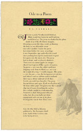
P. C. Vandall’s ‘Ode to a Poem’ first appeared in The Blue Moth of Morning (Porcupine's Quill, 2020). The broadside was created in March 2020 during the COVID-19 crisis, in recognition of the approach of National Poetry Month and with the hope that readers might find comfort—and humour—in poetry.
The text face is Bauer Bodoni, a revival of the so-called Didone serif cut by Giambattista Bodoni in 1798 that was redesigned in 1926 by Heinrich Jost for the Bauer Foundry of Frankfurt as an alternative to the American Type Foundry's (ATF) Bodoni Font Family of 1907. Bodoni is characterized by sharp, thin serifs and is frequently used for display purposes given its high contrast and very pronounced vertical stress.
The titling is Bodoni Classic Inline, designed by the German typographer Gert Wiescher in 2013.
The somewhat fanciful initial letter is Ransom Shaded, sometimes called Clearcut Shaded Capitals, designed by Will Ransom (1878–1955) who was a contemporary of the celebrated American typographers W. A. Dwiggins and Frederic Goudy.
Pompeii
by John Reibetanz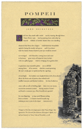
‘Pompeii’ is Part One of a longer poem called ‘Fresco Magic’ that first appeared in Where We Live (McGill-Queen's University Press, 2016) and was reprinted in The Essential John Reibetanz (Porcupine's Quill, 2017). The poem was also featured on Poetry Daily on November 3, 2018.
The display face is Bodoni Classic Inline, which we have only recently acquired because it seemed singularly appropriate to the title of Jeffery Donaldson's Viaticum (Porcupine's Quill, 2019). In this case the distinctive inline letterform is perhaps reminiscent of the fluting on Doric columns. We are particularly enamoured of the ‘sun-gilded grapes’ as they appear in the headpiece engraving, and of the goat that appears seated at the foot of aqueduct wall.
Not the Sweet Cicely of Gerardes Herball
by Margaret Avison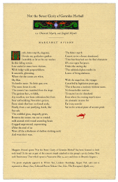
Margaret Avison’s poem ‘Not the Sweet Cicely of Gerardes Herball’ was licensed to Irish rock band U2 for use as part of the concert visuals attached to the group’s Joshua Tree 30th Anniversary Tour, which opened in Vancouver May 12, 2017. The tour was originally scheduled to close in Brussels in August but an added Latin American leg continued on into October. The Joshua Tree Tour in its entirety grossed $317 million, and sold more than 2.71 million tickets from its 51 shows. We do not know why Bono was interested in this poem, specifically, though it may be that Margaret Avison was known as a deeply Christian poet. John Gerarde’s Herball, or Generall Historie of Plantes, was first published in 1597. The book became the most prevalent botany reference in English in the 17th century. The ‘Sweet Cicely’ poem originally appeared in Winter Sun, London: Routledge, Kegan Paul, 1960 and is reprinted in Always Now, Collected Poems Volume One, Erin: The Porcupine’s Quill, 2003.
Old Age Is a Tree with Decaying Bark
by Joe Rosenblatt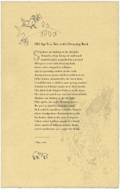
Joe Rosenblatt is perhaps best known as the author of The LSD Leacock which was the second title to appear from Stan Bevington’s fledgling Coach House Press in 1966.
Joe Rosenblatt's ‘Old Age Is a Tree with Decaying Bark’ first appeared in The Bird in the Stillness (Porcupine's Quill, 2016). The broadside was created later that same spring.
The text face is Bauer Bodoni; the initial letter ‘S’ is set in Gill Floriated, a somewhat fanciful design based on a single character that Eric Gill had drawn as a decorated initial for use in a specimen setting of his Perpetua type. Gill was at first reluctant to produce a full alphabet but Monotype advisor Stanley Morison was finally able to persuade him to draw a few more characters from which a full set was extrapolated in 1937 for display casting.
The face was revived by Monotype in 1995 for electronic publishing.
The pen-and-ink drawings are by the poet.
Theme and Variation
by Anne Wilkinson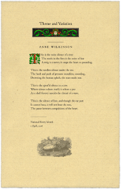
The text is set in Junius, an old-style serif typeface developed by Peter S Baker of the University of Virginia for use, primarily, by mediaevalists. The design is based on a 17th-century typeface used at the Oxford University Press to print George Hickes’ Thesaurus (1705). Junius characterizes an intermediate stage between earlier 16th-century typefaces (Garamond) and later 18th-century typefaces (Caslon).
‘Theme and Variation’ first appeared in Counterpoint to Sleep (First Statement, 1951) and was reprinted in The Essential Anne Wilkinson, edited by Ingrid Ruthig (Porcupine's Quill, 2014).
The broadside was released to co-incide with National Poetry Month, April, 2016.
The Marché aux Puces and the Jardin des Plantes
by Daryl Hine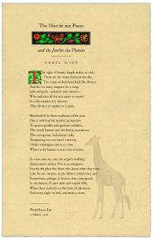
Daryl Hine was a Canadian poet who came to prominence at Poetry (Chicago) where he served as editor for a decade (1968–78). We didn't know Daryl Hine, but we did know Hine's good friend Virgil Burnett, an artist, originally from the American Midwest who served with the US Army in Paris in World War II and subsequently settled in Stratford, Ontario. It was Virgil Burnett who persuaded us to do an illustrated edition of Hine's Arrondissements, which we did, in 1986; and then it was James Pollock who persuaded us to do The Essential Daryl Hine, which appeared in 2015.
‘The Marché aux Puces and the Jardin des Plantes’ first appeared in Minutes (Atheneum, 1968) and was reprinted in The Essential Daryl Hine (Porcupine's Quill, 2015).
The broadside, as it appears here, was issued to co-incide with World Poetry Day, 21 March, 2016.
Late Love Poem
by Richard Outram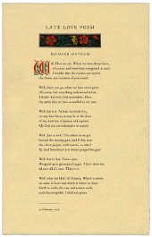
Richard Outram’s love for his wife Barbara Howard was the stuff of legend. Outram was also known as a ‘poet’s poet’ whose command of the English language as well as the intricacies of verse metrics could be daunting, if not impenetrable (to some, more than others). Outram had his acolytes, as well as his detractors. In this case we see the poet at play with trite colloquialisms ... ‘Here we are’, ‘there you go’, ‘this is it’, ‘Just as well’, ‘that is that’ and, finally, ‘what the Hell’. Perhaps the most challenging reference in the poem could be to the Latin QED (quod erat demonstrandum) which can be used as a synonym for ‘that is that’ or it can also be used in the somewhat edgier sense of ‘Up yours’.
‘Late Love Poem’ first appeared in Dove Legend (Porcupine's Quill, 2001) and was later reprinted in The Essential Richard Outram (Porcupine's Quill, 2011) selected by Amanda Jernigan.
The broadside, as it appears here set in Junius, was created for Valentine’s Day in 2016.
The Porcupine's Quill would like to acknowledge the support of the Ontario Arts Council and the Canada Council for the Arts for our publishing program. The financial support of the Government of Canada through the Canada Book Fund (CBF) is also gratefully acknowledged.